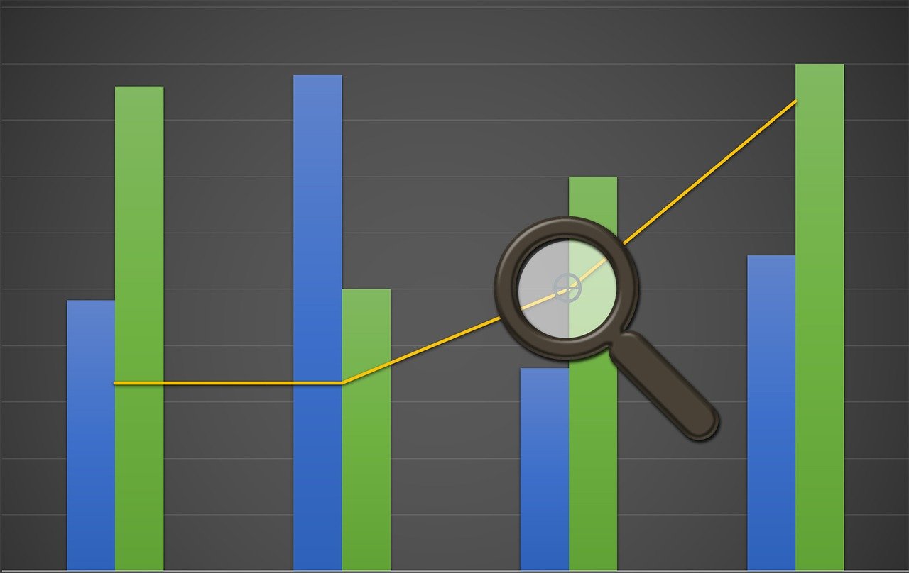
Visualizing Financial Results Using Excel Charts and Graphs
Effective financial modeling involves translating complex data into meaningful visuals. Excel provides numerous tools to create dynamic charts and graphs for this purpose. Through visual representation, stakeholders can better assess trends, patterns, and forecasts. The goal is to communicate financial results clearly and concisely. Various chart types, such as pie charts, line graphs, and bar charts, serve different analytical purposes. Each visual tool can illustrate specific data aspects, making it essential to understand their functionalities. For instance, pie charts effectively highlight proportionate data. In contrast, line graphs excel at displaying changes over time. To select the best chart type, one must consider the data’s nature and the visual message intended. Moreover, data formatting, color schemes, and design elements significantly influence the visual’s effectiveness. For optimal visualization, using consistent styles and data representations is crucial. Effective financial charts not only convey information but also foster insightful discussions about the data and its implications. As we explore Excel’s capabilities, we’ll develop actionable financial visualizations that aid in decision-making and ultimately impact strategic planning.
Leveraging Excel for Financial Dashboards
Excel is an invaluable tool for developing financial dashboards that summarize performance metrics effectively. Creating a dashboard involves integrating multiple data sets into a cohesive visual format. This allows users to assess their financial position at a glance. Key performance indicators (KPIs) often populate these dashboards for ongoing monitoring. Moreover, Excel’s pivot tables and slicers enable dynamic data analysis. By filtering data based on various criteria, users can dissect performance metrics historical data and detect emerging trends. Additionally, conditional formatting options further enhance dashboard visibility by highlighting key figures. As a result, analysts can quickly identify areas needing attention. Combining these features into a single dashboard creates a powerful tool for financial reporting. Furthermore, dashboards encourage collaboration and alignment among team members. By presenting financial insights in an easily digestible format, stakeholders can make informed decisions swiftly. The use of graphs, colors, and interactive elements ensures an engaging experience. Through Excel, financial professionals can enhance their dashboard’s functionality, yielding impactful visualizations and fostering organizational efficiency. Thus, mastering Excel’s dashboard capabilities is crucial for financial success.
Adding Value with Interactive Charts in Excel
Interactive charts within Excel allow users to engage with data dynamically, enhancing the analytical experience significantly. User interactivity provides valuable insights by enabling the exploration of various datasets visually. Utilizing tools such as drop-down menus, sliders, or option buttons, users can modify chart displays based on specific criteria. These interactive elements transform static information into a more engaging and informative format. Additionally, they stimulate user curiosity, encouraging further exploration of financial dimensions. For instance, creating a revenue forecast chart that can display monthly, quarterly, or yearly perspectives empowers users with relevant decision-making options. Moreover, integrating tooltips or data labels enhances understanding by providing additional context. Understanding these interactive functionalities maximizes Excel’s potential to present complex financial information succinctly. Thus, engaging with multiple scenarios reacts to changes in underlying data forecasts, leading to a more in-depth understanding of financial dynamics. Leveraging these features in reports can impress stakeholders, facilitating discussions that promote strategic planning. Thus, focusing on creating highly interactive visualizations within Excel is key to driving deeper financial insights and facilitating better business decisions.
Best Practices for Effective Graphs and Charts
To ensure financial visualizations are effective, adhering to best practices is essential when creating graphs and charts in Excel. First and foremost, simplicity is paramount; overly complex visuals can confuse rather than clarify. Strive for clarity by limiting the number of data points displayed at any time. Furthermore, employing appropriate color schemes enhances comprehension and engagement. Colors should differentiate data sets but remain harmonious to avoid overwhelming the viewer. Incorporating labels and legends is also crucial; these elements provide context while aiding interpretation. For instance, labeling axes clearly ensures that stakeholders understand the data represented accurately. Moreover, consistency across charts boosts clarity—using the same colors, fonts, and styles allows easier comparison between graphs. Additionally, ensure that your chart’s title succinctly conveys the information presented. Utilizing Excel’s features, such as trendlines and error bars, can further enhance the storytelling aspect of financial data. By following these best practices, you pave the way for successful communication of financial results. Ultimately, the primary aim is to drive informed decision-making and foster deep understanding of the financial data being presented to its audience.
Utilizing Data Visualization to Tell a Financial Story
Data visualization is a powerful tool for telling compelling financial stories through visual representations. By illustrating trends, forecasts, and analyses, stakeholders gain insights to inform their decisions. In this context, Excel serves as a platform that enables financial experts to convert numbers into stories effectively. This transformation begins with the selection of relevant data points, focusing on those that contribute meaningfully to the narrative. The story might revolve around revenue growth, expense management, or market trends—each aspect requiring tailored visuals. A clear visualization shines a light on the evolving financial landscape, helping to highlight opportunities or identify potential risks. Using appropriate chart types enhances storytelling; for instance, employing a line graph to showcase revenue trends helps visualize growth trajectories. Additionally, annotations within the chart can guide viewers through findings or conclusions derived from the data. As stakeholders engage with these visual storytelling elements, it leads to more profound conversations and strategic planning sessions. Ultimately, mastering visualization within Excel is invaluable for communicating financial results effectively, thus maximizing the impact of analytical storytelling on overall business objectives.
Integrating External Data Sources into Visualizations
Integrating external data sources into Excel enhances the richness of financial visualizations, providing a comprehensive view of performance. This process often involves pulling data from various platforms, such as financial databases, market feeds, or even enterprise resource planning systems. By consolidating this information within Excel, analysts can compare internal financial performance against external benchmarks. This comparison can deliver valuable insights into market positioning and competitive performance. In addition, utilizing Excel’s Power Query helps import and transform data effectively. This capability streamlines data preparation while ensuring accuracy and consistency. Once integrated, these datasets can be visualized through charts and dashboards that reveal performance disparities and opportunities. Effective visual storytelling emerges from integrating diverse information sources strategically. Moreover, employing external datasets allows organizations to augment analysis with contextual market trends. By considering both internal and external metrics, financial professionals can make nuanced decisions. Excel empowers users to synthesize data effectively, creating impactful visualizations. Consequently, mastering data sourcing and integration methods within Excel is critical to enhancing financial modeling endeavors and acing the competitive landscape in today’s business environment.
Designing Effective Reports and Presentations
Designing reports and presentations is where visualizations come alive, leading to impactful financial storytelling. Excel’s charting features allow financial professionals to encapsulate vast amounts of data into engaging formats. For successful reports, clarity, organization, and professionalism are essential. Every chart should have a clear title and logical sequencing of information. Utilizing templates can promote consistency across various documents and enhance the overall aesthetic appeal. Furthermore, employing effective layouts facilitates the easy flow of information from one section to another, guiding the audience through the narrative. Charts and graphs should complement the written content, ensuring no redundancy exists. Additionally, including key takeaways or insights alongside visualizations reinforces the message. Maintaining a professional tone throughout the presentation aids in instilling confidence among stakeholders. It is crucial to rehearse the presentation to anticipate potential questions about the visualizations employed. Excel’s ability to generate automated report updates also saves time and ensures accuracy. Ultimately, well-designed reports and presentations that utilize Excel visualizations effectively drive discussions, enabling informed decision-making and fostering organizational success in financial planning.
Engaging Stakeholders with Effective Visual Communication
Engaging stakeholders involves providing compelling financial insights through effective visual communication. The art of communication lies in precisely translating complex data into succinct visual narratives. Excel facilitates this process by offering user-friendly visualization tools tailored for comprehensive financial storytelling. By employing charts, graphs, and dashboards, financial professionals can capture their audience’s attention. It is vital to know the audience; understanding their needs and preferences will influence the type of visualizations chosen. For instance, senior executives may prefer succinct dashboards highlighting key metrics, while analysts may benefit from more detailed reports. Moreover, utilizing contrasting colors ensures essential data points stand out while remaining visually pleasing. Incorporating multimedia elements, such as images or videos, can enrich the visual experience, thereby enhancing engagement. Crafting presentations around these visuals encourages interaction and discussion, facilitating deeper exploration of financial scenarios. Additionally, providing downloadable copies of reports enhances accessibility and fosters transparency. Effective visual communication ultimately cultivates trust and loyalty among stakeholders, paving the way for collaborative decision-making processes. Excel empowers professionals to create visuals that resonate, fostering a shared understanding of financial results across the organization.